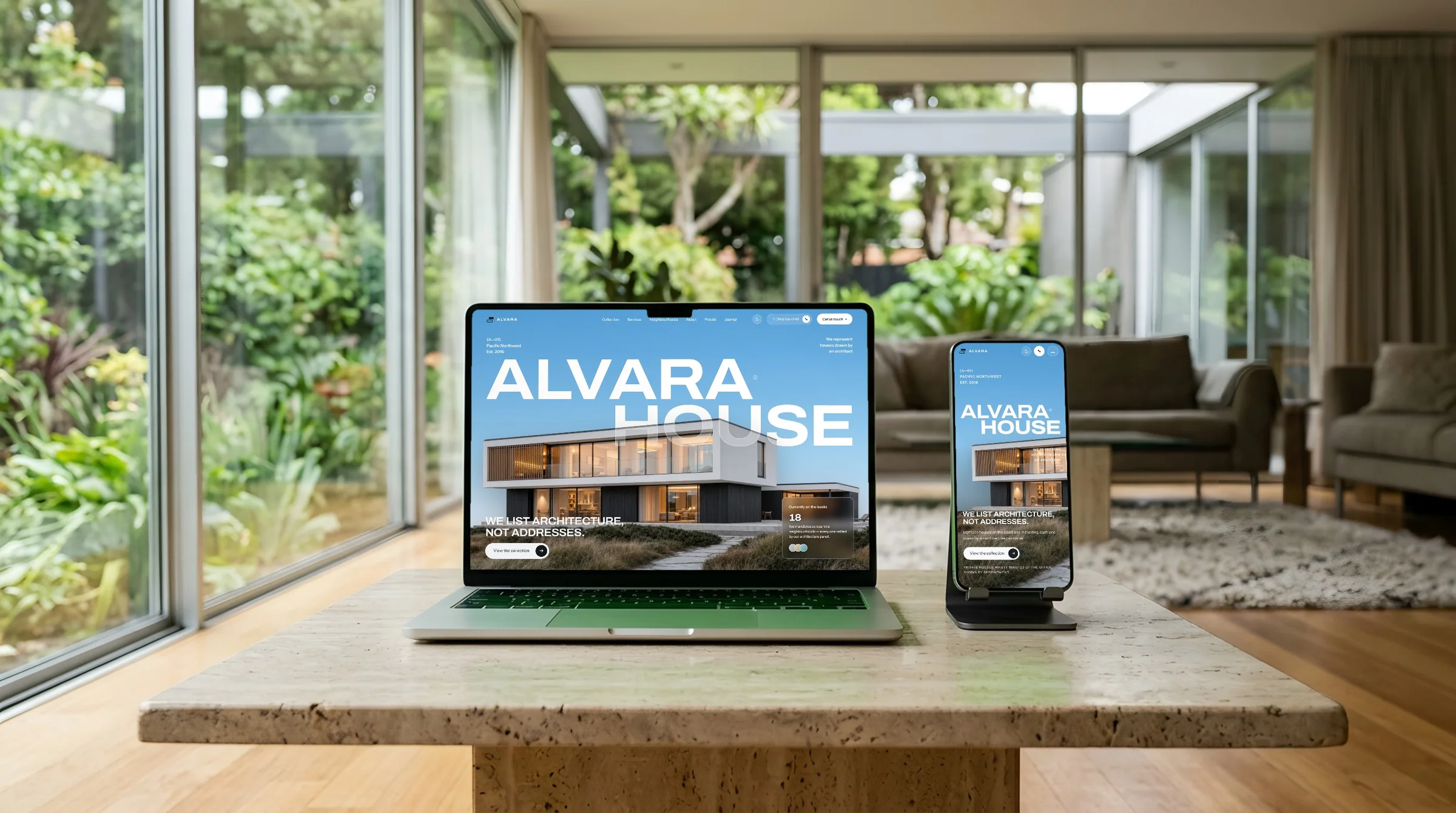
The brief
A SaaS marketing site is judged on completeness, not just its hero — a buyer wants to see pricing, integrations, and security posture before they trust a product with their team's data, and most landing-page demos stop at the homepage.
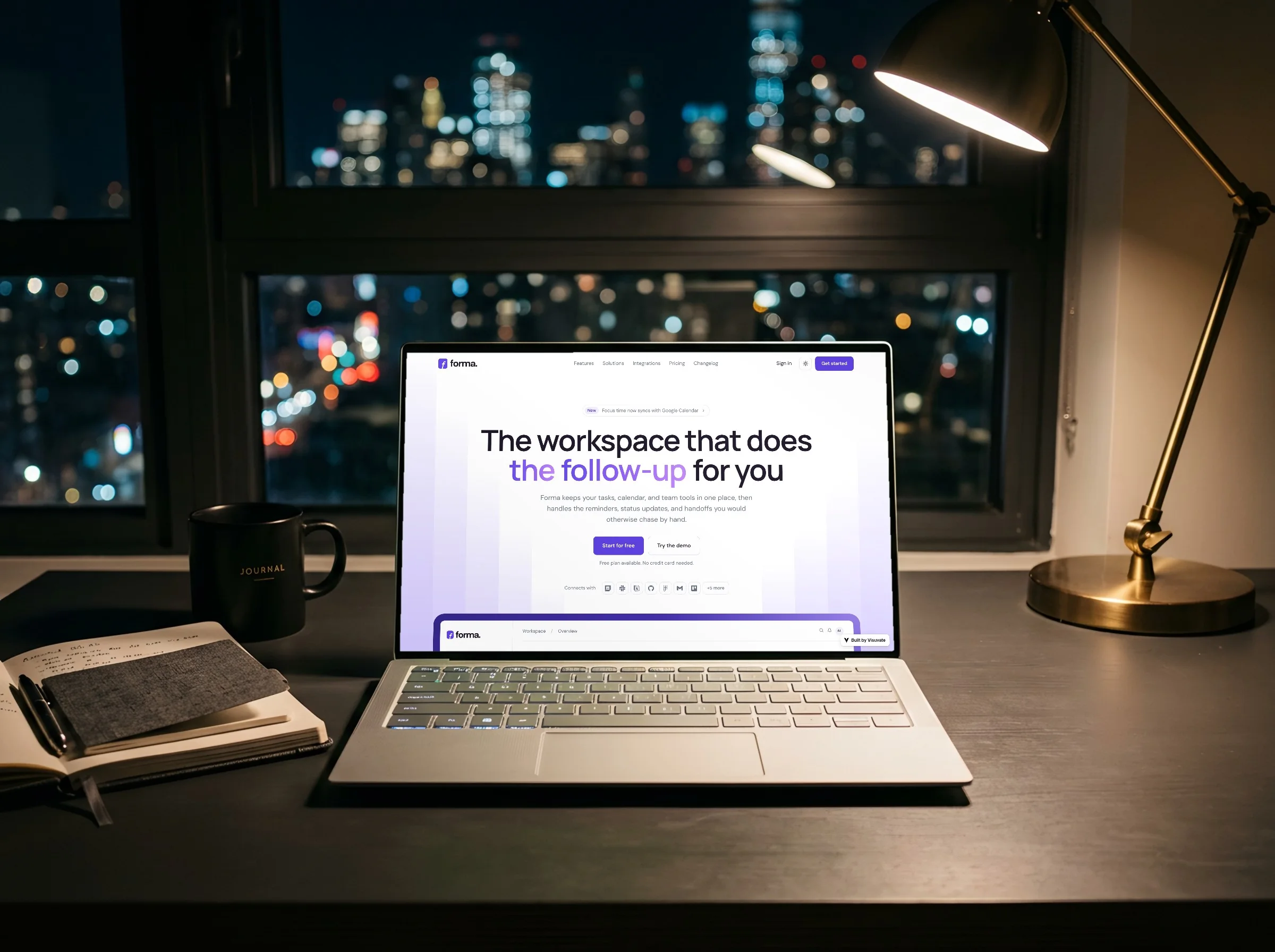
A SaaS marketing site is judged on completeness, not just its hero — a buyer wants to see pricing, integrations, and security posture before they trust a product with their team's data, and most landing-page demos stop at the homepage.
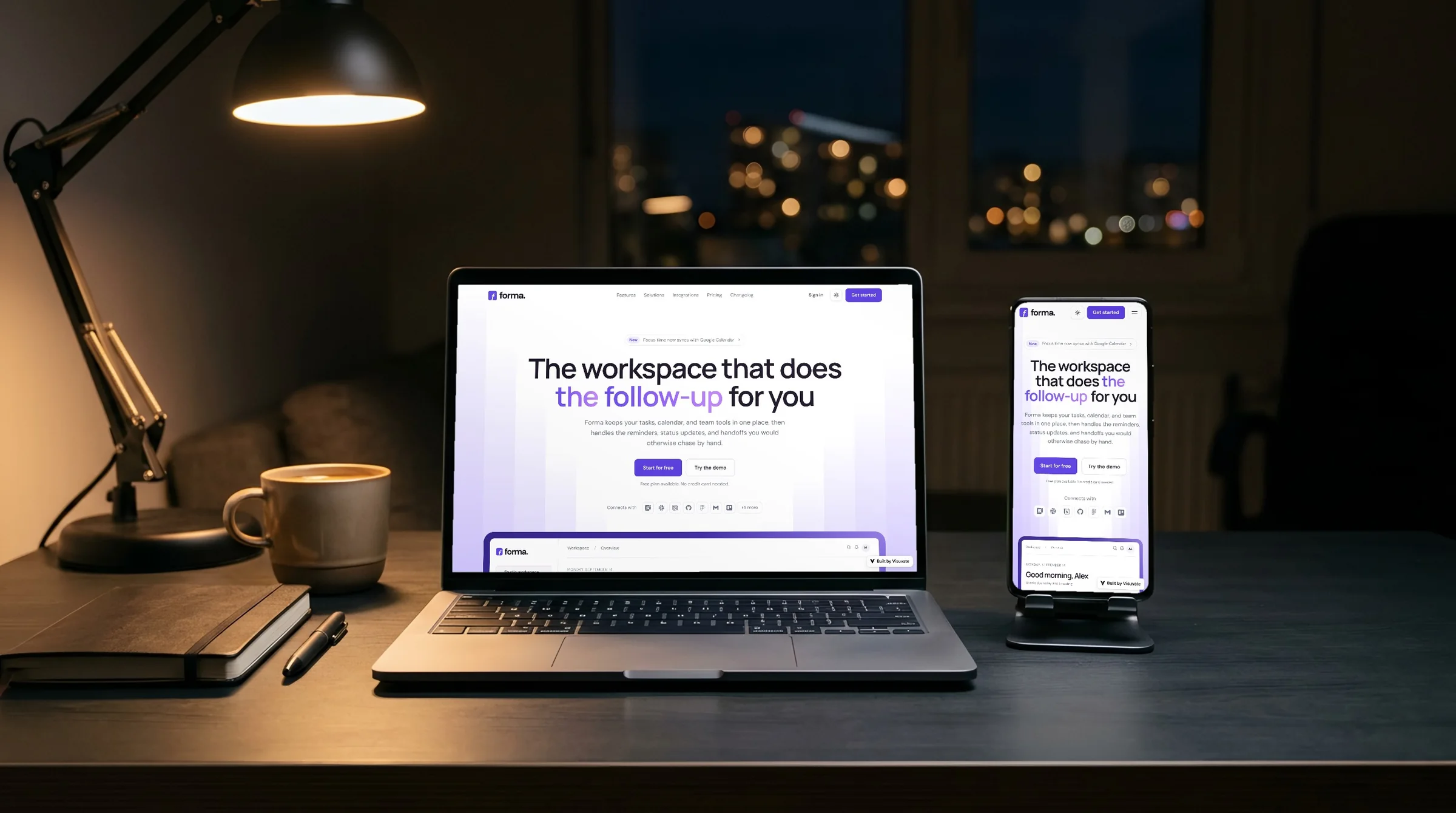
Forma was built as twelve full pages rather than one, sharing a single dashboard mockup as the visual through-line. Dark and light themes were designed natively side by side, never one simply inverted from the other.
Desktop and phone, exactly as Forma visitors see them.
Visit forma.visuvate.com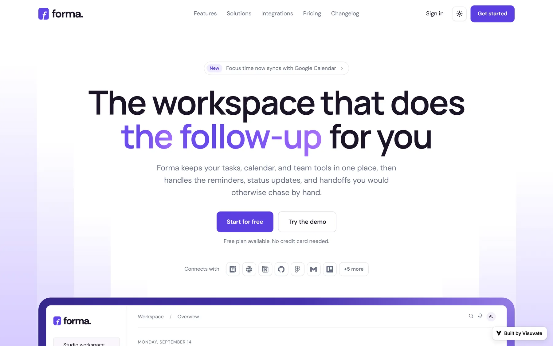
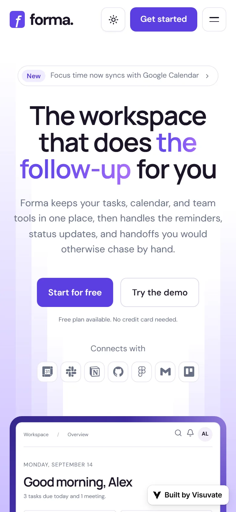
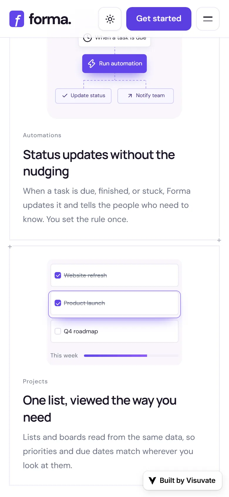
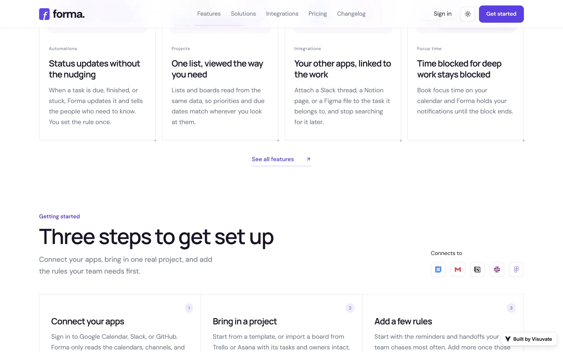
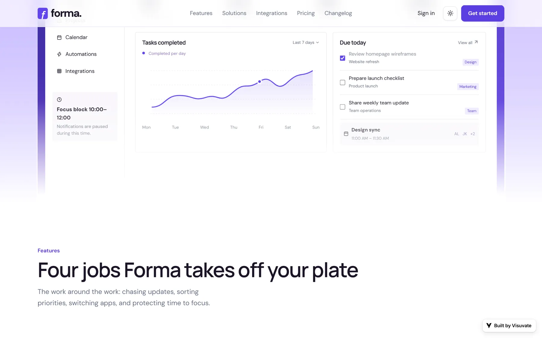
The result reads as a shipped product rather than a mockup: a visitor moves from the headline through features and pricing into a real sign-up flow, landing on a dashboard preview that matches what was promised.
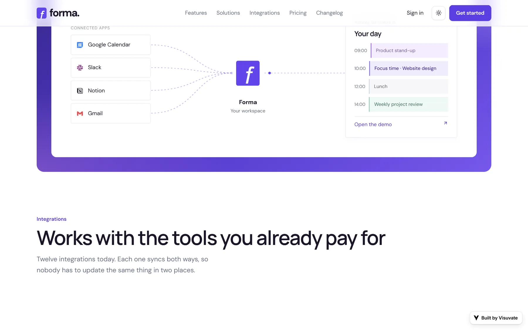
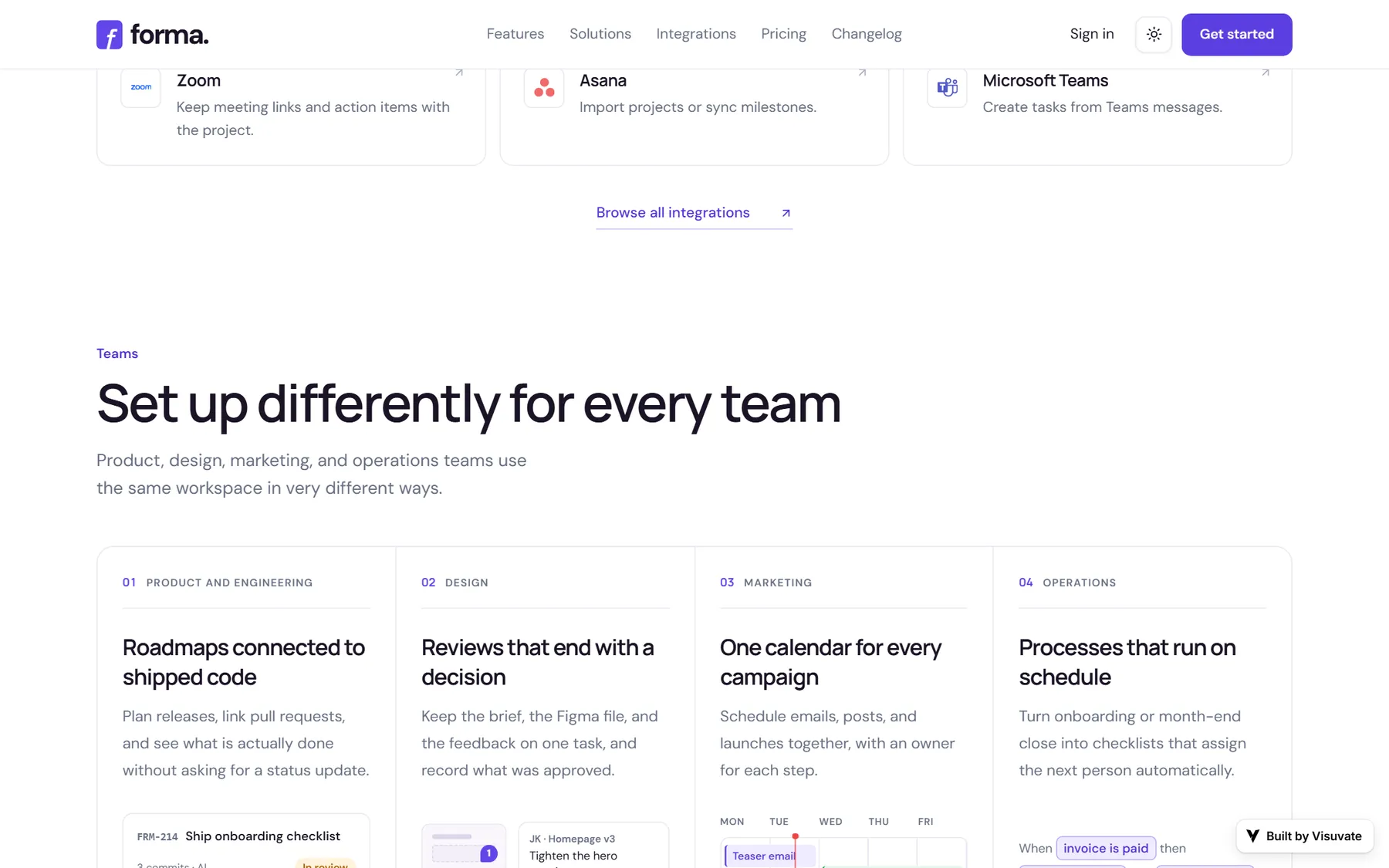
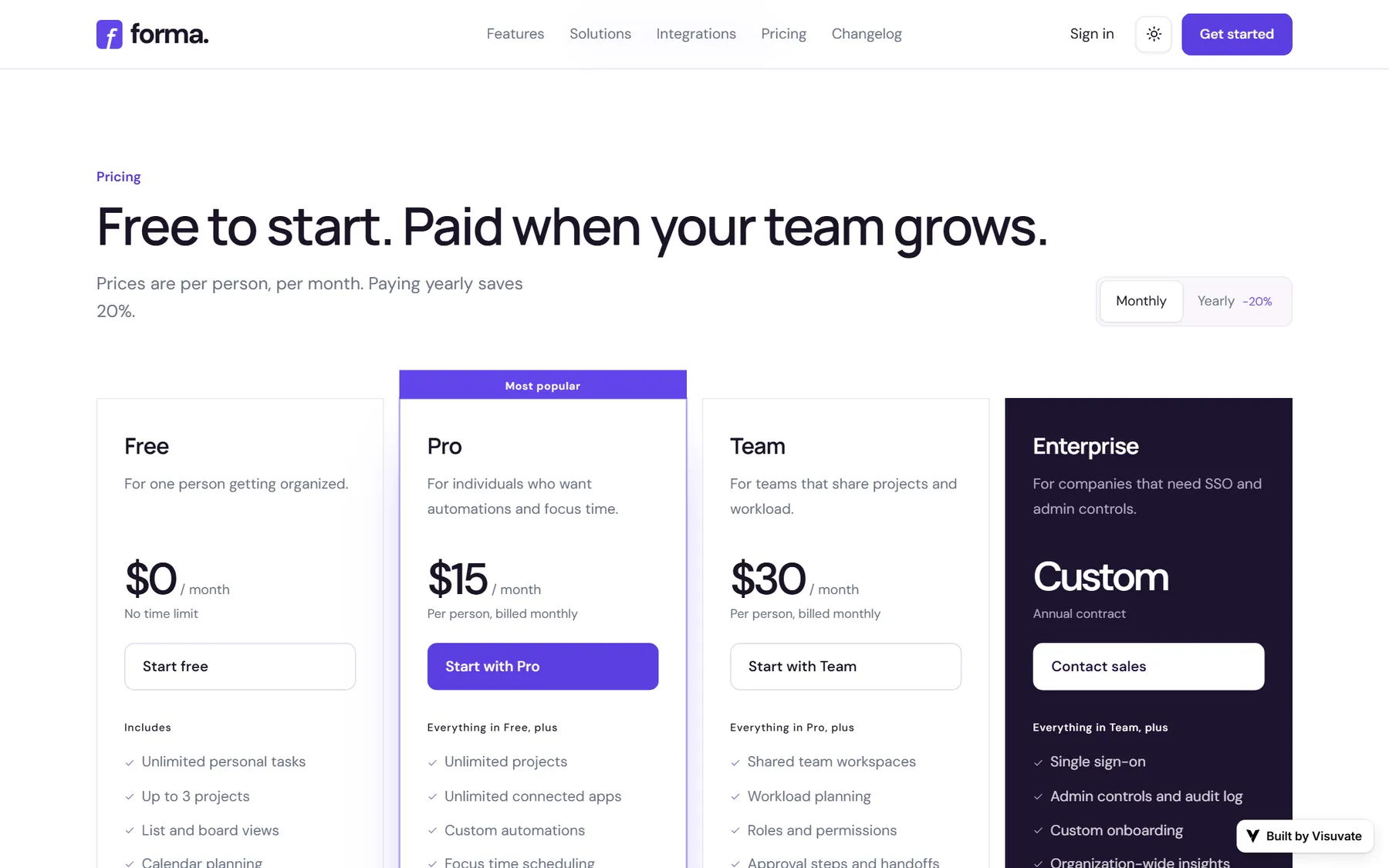
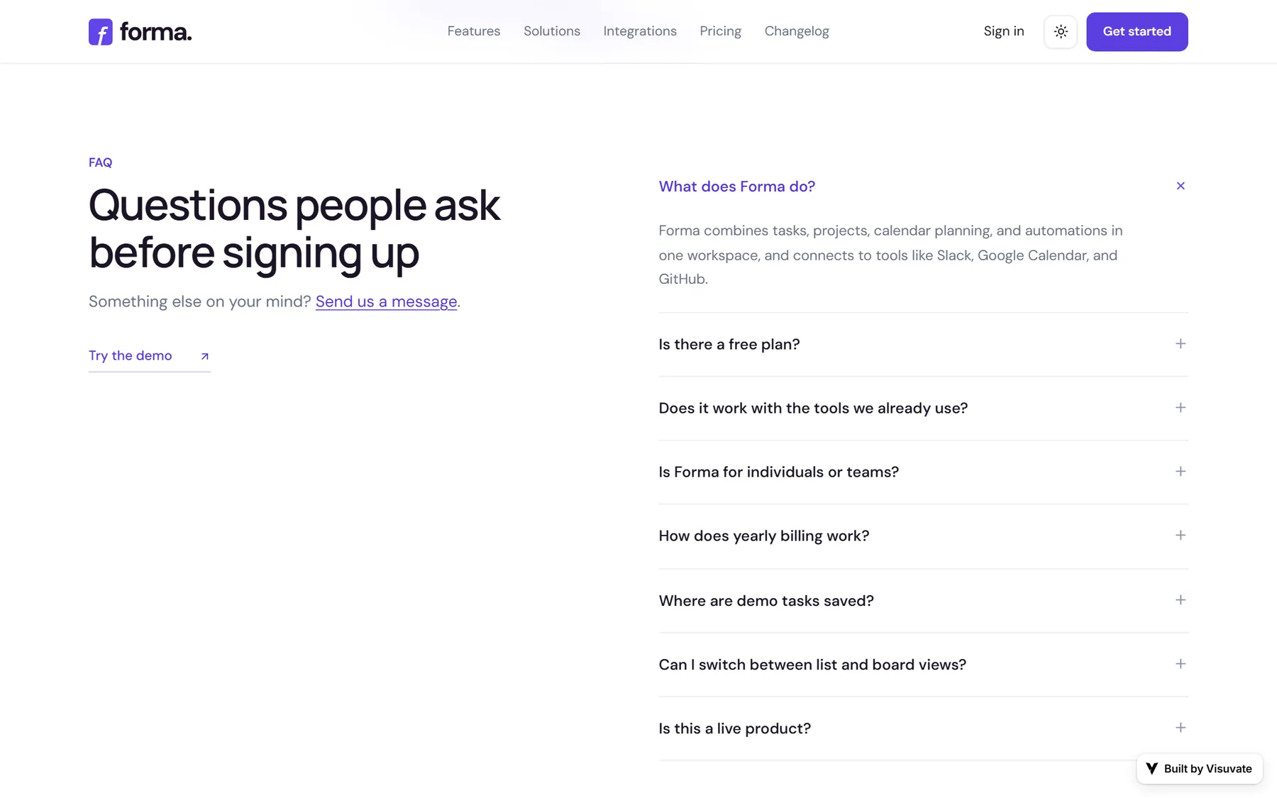
4 more sections of the live site.